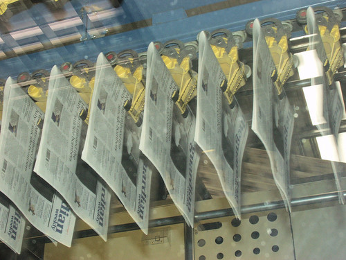
You might have noticed that I’ve been around here a little spasmodically lately, and anyone who knows me might have noticed that the bags under the eyes have hit the jawline; that’s in part because I’ve been involved in the major redesign of the Guardian Weekly, which has gone from tabloid to half-Berliner (“micro” I believe in American), as well as going full-colour in the European edition, and with the complete font and design change that went with it (so we again finally reflect the appearance of the Guardian).
Anyone in newspapers will appreciate that’s been rather a big job: I’ve written about the process, and about how the news gods had a good laugh at my expense, on the editors’ blog on Guardian Unlimited.
But, it’s out tomorrow, it doesn’t look half bad overall, and it’s done – just got to do it all again next week…
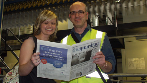
Here’s Jenny Cogan, our production editor, and the designer John-Henry Barac mugging it up for the cameras beside the press. J-H has also blogged about the process.


 About
About